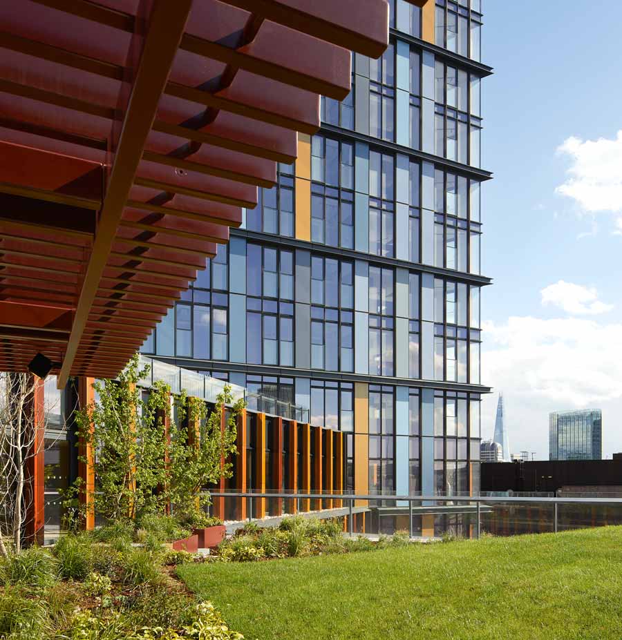
Inner-city areas are becoming ever more densely populated. Mixed-use schemes are increasingly prevalent, while their conflicting spatial requirements are getting more and more challenging. The newly completed One Crown Place – a ‘city within a city block’ that’s been delivered by CBRE Development Management for MTD Group – exemplifies all of this very well. In this article, our design director Steve Toon shares some insight from the project’s new high-rise elements, and examines the engineering moves that have safeguarded their uses’ functionality.
One Crown Place is a mixed-use redevelopment that occupies almost all of an entire urban block. It sits just north of the Broadgate campus, which forms part of the historic City of London, though it technically falls just inside of Shoreditch, at the southern edge of the neighbouring, trendy borough of Hackney. The Hackney-City border in fact runs right down the middle of Sun Street: the plot’s southern boundary.
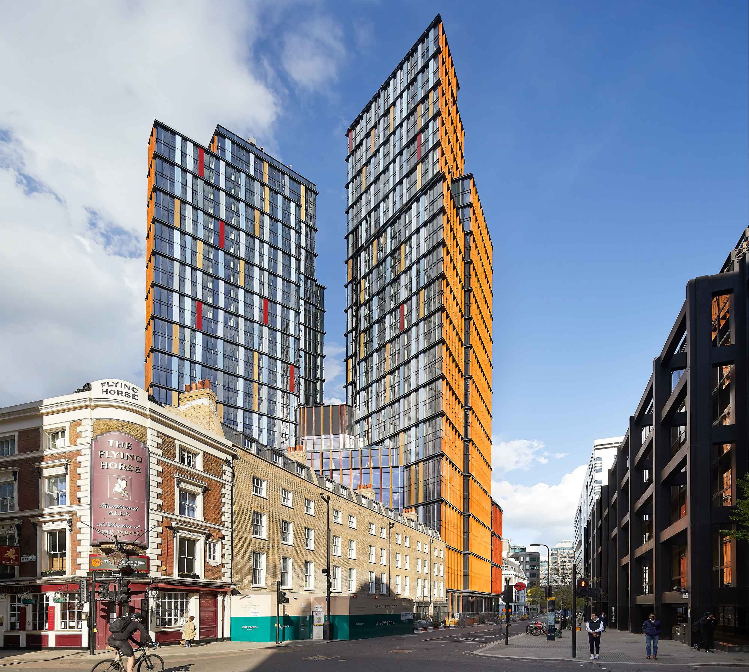
This entire site has now been transformed with a diverse mix of old and new estate. Some dramatic new, mixed-use high-rise volumes are introduced at the site’s eastern end, while a 1970s office block is assimilated and refreshed, and six Georgian townhouses are restored to become a boutique hotel and members’ club. A Victorian warehouse façade is also saved and integrated.
Throughout, the streetscape is newly activated with a mix of shops and cafes, while a new central courtyard brings public circulation through the block for the first time. An existing church, and a pub, meanwhile nestle into one corner.
In bringing these uses together, One Crown Place really is a microcosm of London.
The project’s owner – MTD Group – purchased the site in 2013, and together with CBRE’s development arm saw a clear value in the potential of a residential-led, mixed-use scheme. And this soon became the direction for the project. But, as with all city-centre ventures, One Crown Place at the same time presented many planning and townscape challenges which the design team then had to overcome.
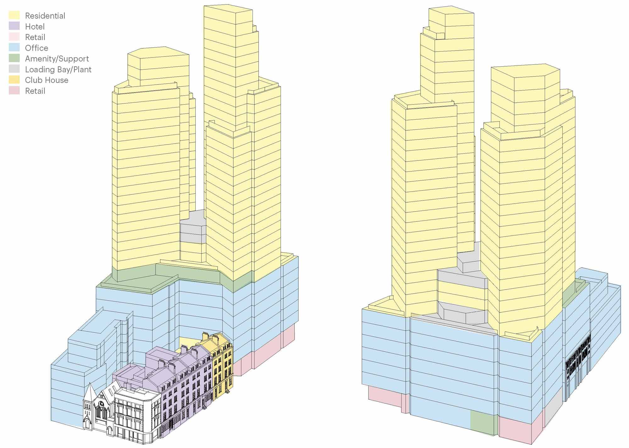
The architect – Kohn Pedersen Fox (KPF) – proposed splitting the new high-rise massing, which contains residential apartments, into two volumes. This divides the visual impact of the notional single tower while also enabling a higher number of residential units for the site, because the sum of the two smaller volumes’ units is actually greater than that of the notional single volume. This has been achieved by slightly off-setting the volumes’ orientation and then off-centring each volume’s core, which also creates dual-aspect apartments that generally face outwards, with great privacy. This is a necessary irregularity that makes the most of London as viewed from all points on the compass.
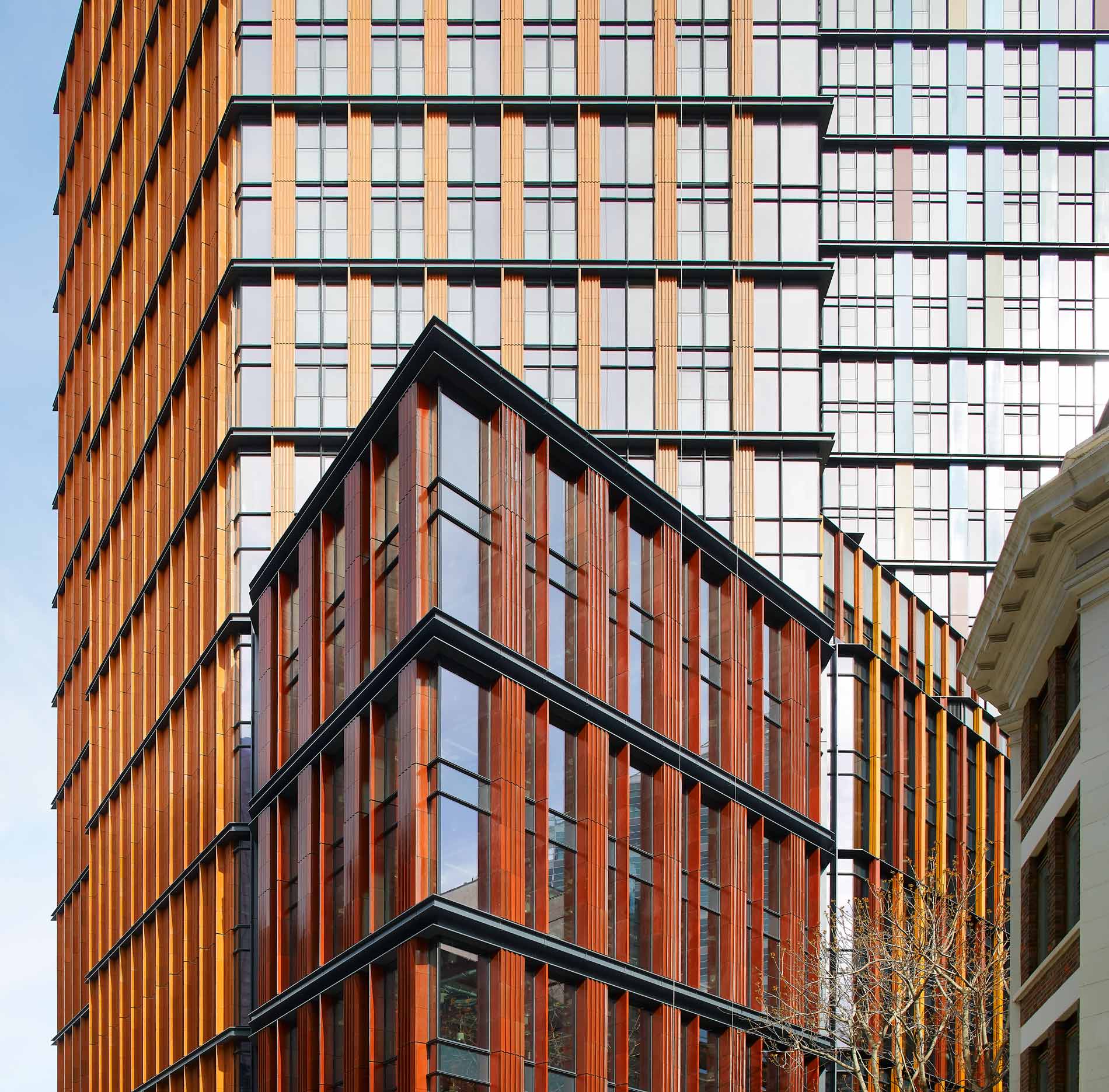
However, in addition to these two residential towers, there is also a third volume: a mid-rise podium block, which contains open-plan office space. And this sits directly beneath the (already substantial) residential programme.
The result is a vertical juxtaposition of uses and layouts, and a fundamental conundrum for the design team:
How do we structurally, and thus spatially, optimise the stacked office and residential volumes for their respective uses, while also making sure that there’s then no compromise, in design nor in value, from one to the other?
So, with the desired massing and uses fixed (in principle, at least), the design team now had to find a way to resolve these apparently conflicting structural configurations, complete with the resultant, clashing grids.
It was a relatively straightforward decision to opt for a post-tensioned, flat-slab typology for the upper volumes. This system offers a slim structural zone, with in-built acoustic and fire performance, and general longevity. Modern methods of construction (MMC) were also considered but these proved prohibitively problematic due to the irregular geometry of the towers and the podium. The residential structure was most conducive to concrete, and ultimately would be built in situ.
As for the offices, the initial architectural intent was similarly for a concrete solution, with its structural finishes to be visually expressed as part of the interior aesthetic. In many ways, this materiality would work hand-in-hand with the towers above, and it would also allow the same, continuous team of subcontractors to deliver the entire construction.
But we still had to figure out the structural transfers; how do we integrate the angled residential grids and layouts on top of the orthogonal open-plan office space below?
So we first explored some concrete-based transfer systems that would have formed part of the architectural impression. We looked at two options: a slanting exoskeleton that would gently taper through the height of the towers’ façades, versus some internal ‘wing walls’ that would branch, outwards and upwards, from the building’s full-height cores. And both of these options had their merits. They also both presented some further complexities which inexorably would have diluted the residential designs.
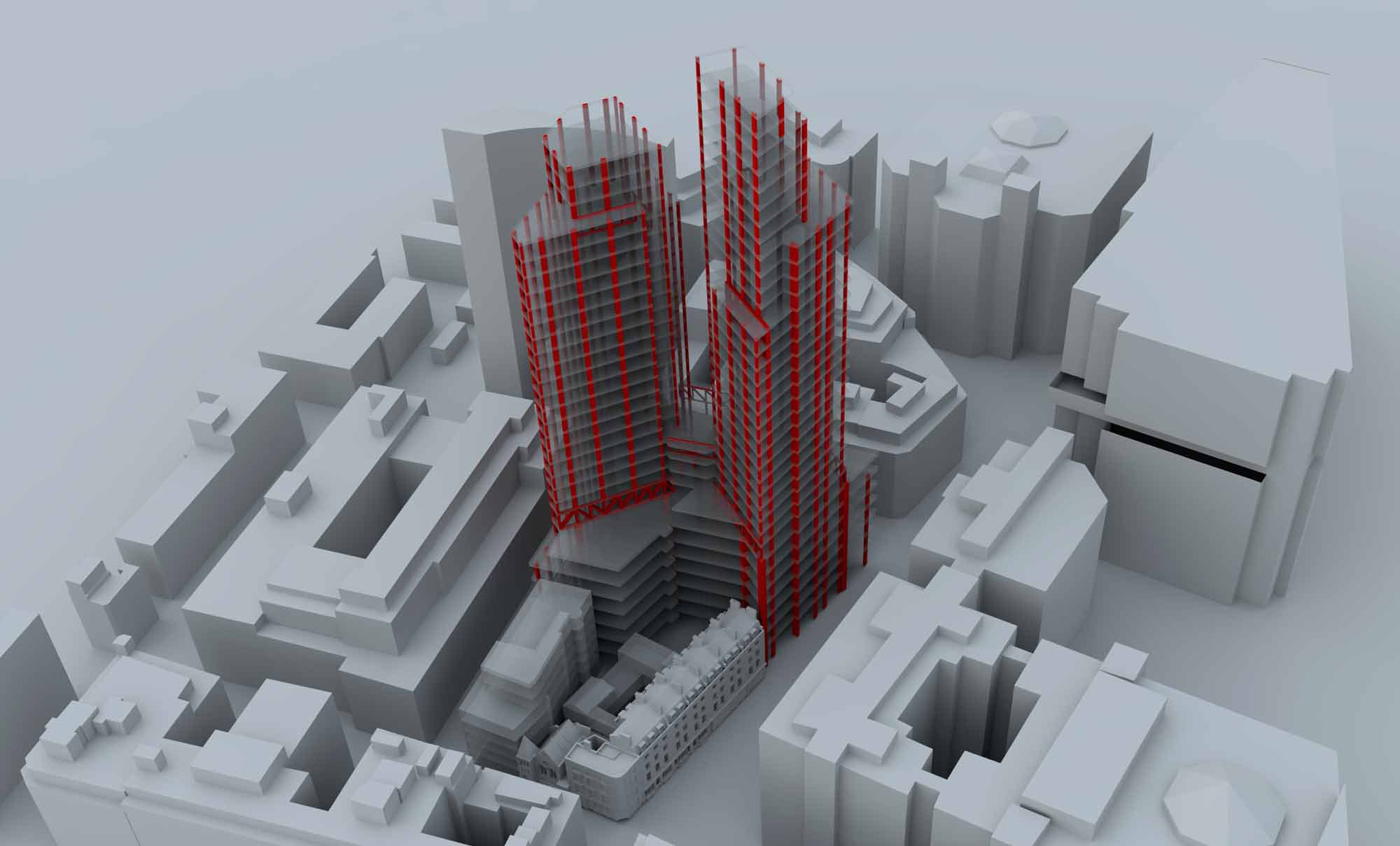
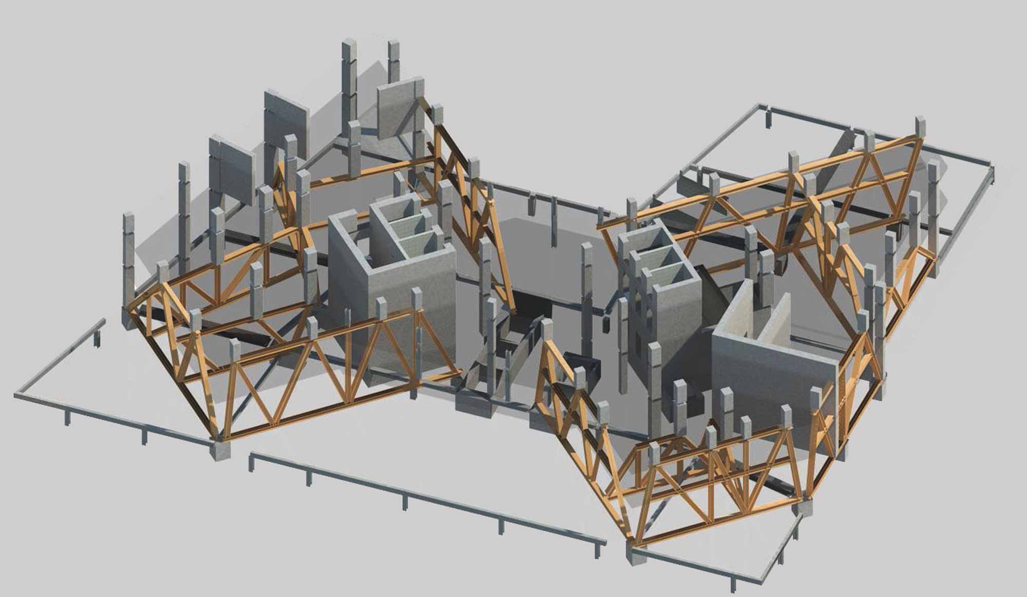
Eventually, we instead concluded on a ‘Brunelian’ approach. The completed building features a compact zone of transfer trusses that integrate, surgically, within the amenity floors that are sandwiched between the development’s lower and upper components. The tallest of these trusses is two storeys high; most are single storey. The large loads and oblique spans require all of these trusses to be steel.
The adoption of steel trusses also directed us towards a steel solution for the office space below. While this wasn’t initially, necessarily the architecturally preferred solution, its merits soon became apparent: the transfers could be integrated on top of the office volume as a singular, cohesive structural ‘base’ for the entire building. A single subcontractor could also now deliver the required, complex structural arrangement, holistically, up to the springing point of the residential floors.
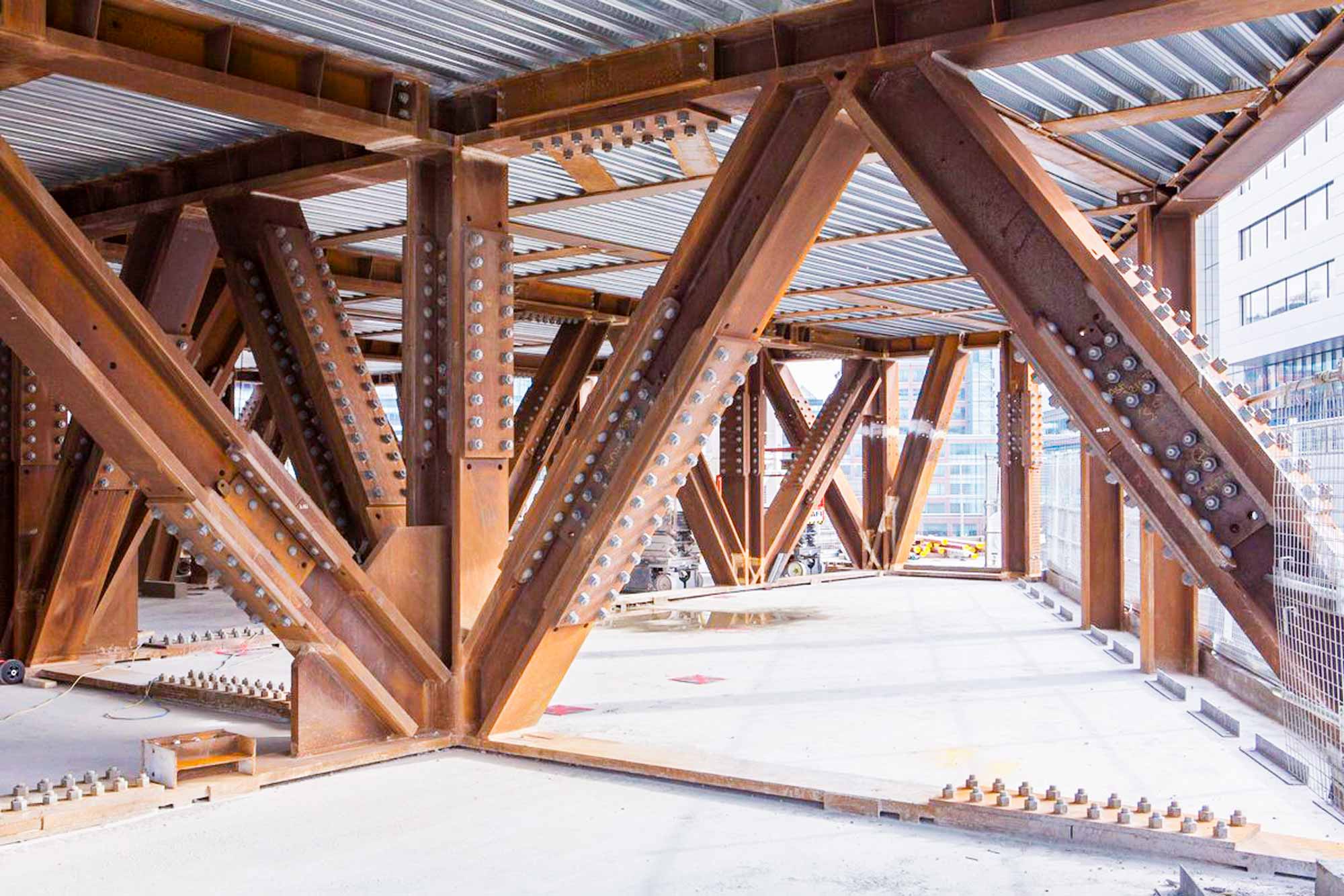
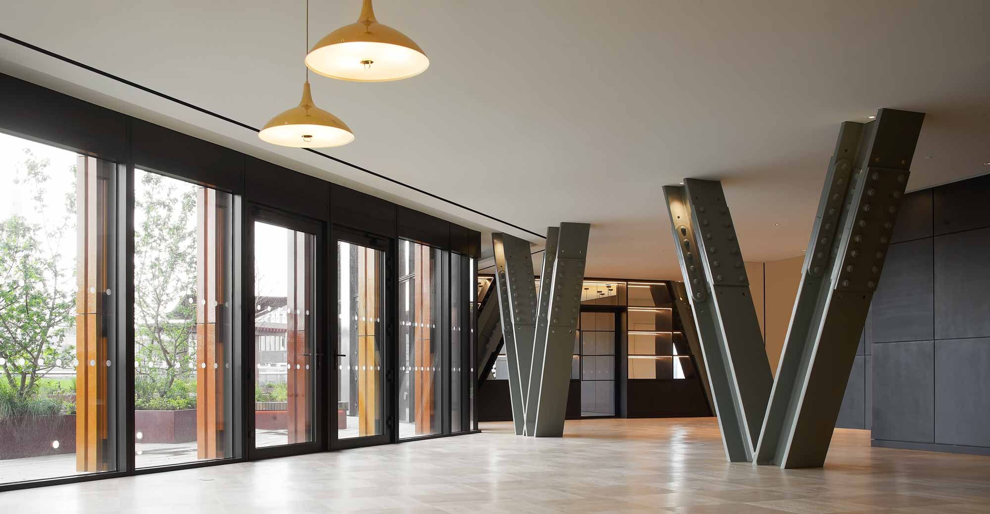
The steel-reinforced, post-tensioned concrete frames of the residential volumes then launch upwards from the top of these transfer trusses.
The merits of this approach were soon bought into by the entire design team, and especially when it became evident that the residences and amenity spaces could embrace these trusses as a dramatic architectural feature within their interior designs.
From that point onwards, the office spaces were developed around this steel-framed approach, with its column-free, highly configurable interior.
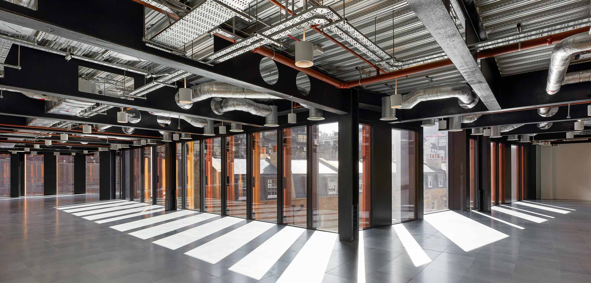
As you can imagine, the subsequent construction of these deep transfer trusses, atop a seven-storey office building, was not without its challenges, and particularly on such a constrained, city-centre site. So to verify the design’s viability, we called upon our contacts within the UK’s steel fraternity, and with their expertise we were able to sense-check the buildability before Mace was even appointed as the main contractor.
We also worked closely with Mace, and with the frame subcontractor Severfield, to work out the best splicing and sequencing for the site’s physical constraints and its associated craning capabilities.
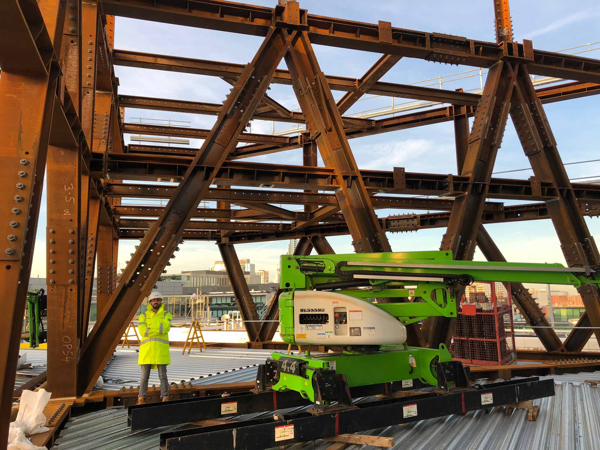
Many of these spectacular trusses are now wholly visible within the completed building. In fact, the idea of any on-site welding to minimise their visual impact was never even on the table. It’s been rumoured that the ‘trussed’ residential interiors were the development’s very first to sell, while the trusses also form a feature for the residents’ amenity areas – appearing in the gymnasium, work hub and dining spaces.
The client, the architect and the interior architect all saw the benefits of exposing these trusses as a prominent character within One Crown Place’s design story.
The building’s engineering has been celebrated.
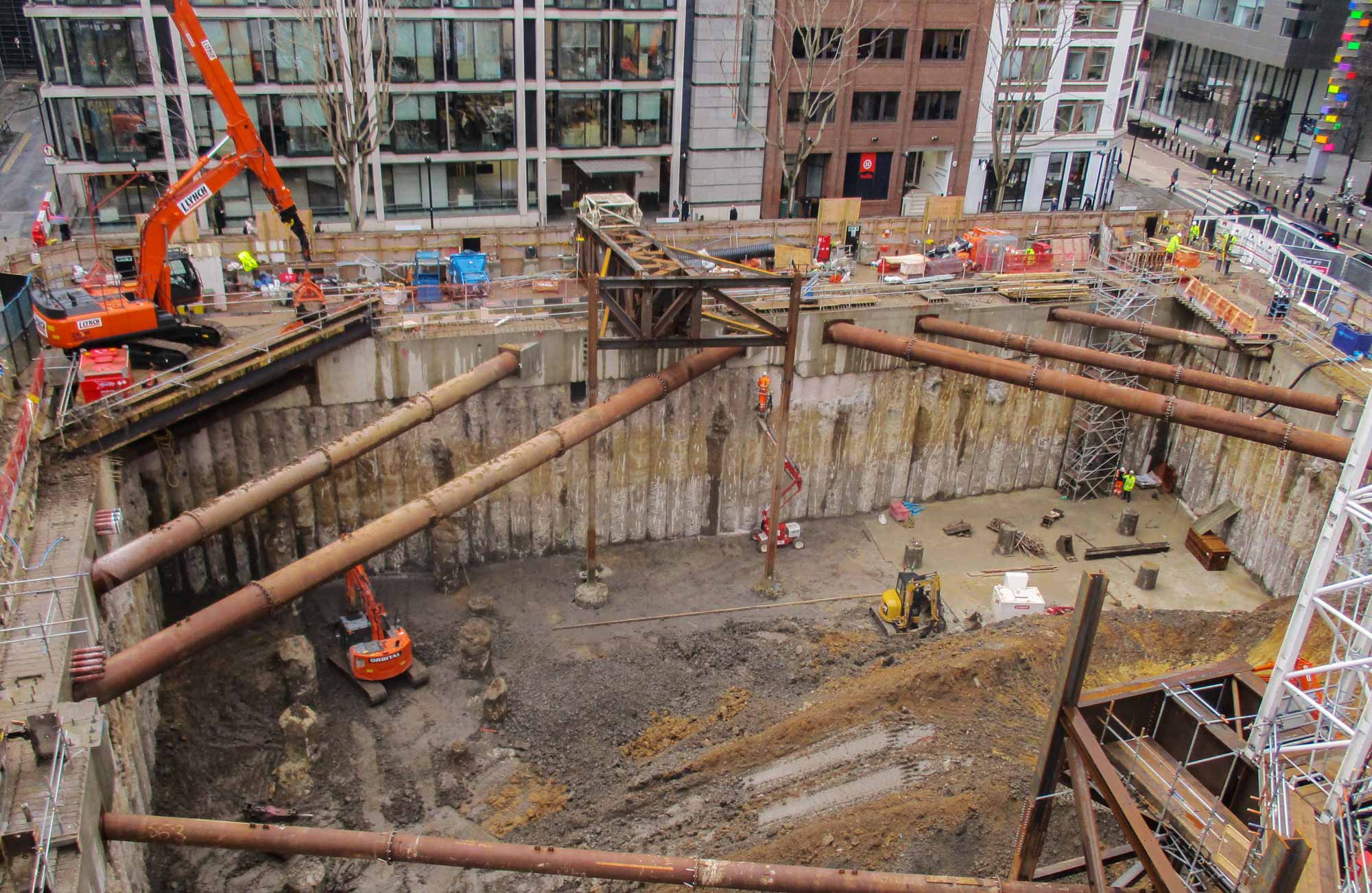
Amidst all of this high-rise construction and heritage redevelopment, a vast new multi-level basement has also been introduced, covering the entire site. This new substructure extends right up to the boundaries of the church, the pub, and the retained facades. And it’s a product of the new ‘micro-city’ typology that One Crown Place now represents.
These massive mixed-use estates require a lot of heating, ventilation, and vehicular servicing, while the occupants equally deserve an accessible, landscaped public realm, complete with gardens and rooftop terraces. Creating additional space beneath the programme, i.e. within the ground, is one solution.
In the case of One Crown Place, the project’s site and its potential programmatic value have together justified the heavy-duty transfer solution. The residences must deliver for their location and sale potential, while the commercial spaces must compete with their neighbouring, central-London counterparts. On this project particularly, the geometric agility has additionally helped to maximise the functional massing.
But, at the same time, we must also recognise that this sort of solution is the exception, and certainly not the rule. With each new project, we must always weigh up any such technical complexities against the challenges, and the opportunities, that they present.
